Flora Ghost theme supports all Ghost editor cards and also provides a base design for any type of content a writer might publish.
Headings
Headings are used to structure your page and improve readability. There are six levels of headings (H1 to H6), with H1 being the most important and H6 being the least. Use H1 for your main page title and subsequent headings to organize the rest of your content. Ensure headings follow a logical hierarchy; don't skip from H1 to H3 without an H2.
Heading One
Heading Two
Heading Three
Heading Four
Heading Five
Heading Six
Lists
Lists help organize information clearly and concisely. Use unordered lists (with bullet points) when the order of items doesn't matter, such as a grocery list or a set of features. Use ordered lists (with numbers) when the sequence of items is essential, like step-by-step instructions or a ranked list.
- List Item One
- List Item Two
- List Item Three
- List Item Four
- List Item Five
- List Item A
- List Item B
- List Item C
- List Item D
- List Item E
Blockquotes
Blockquotes are used to highlight extended quotations from other sources. They visually separate the quoted text from your own content, often by indenting it. Use blockquotes to emphasize important passages, present testimonials, or when directly referencing another author's work. Be sure to cite the source of the blockquote if you have it.
'History is always written by the winners. When two cultures clash, the loser is obliterated, and the winner writes the history books. Books, which glorify their own cause and disparage the conquered foe. As Napoleon once said, "what is history, but a fable agreed upon?"' — Dan Brown
There are two styles of blockquote available that can by cycled through by repeatedly pressing the blockquote toolbar icon.
'People are always shouting they want to create a better future. It's not true. The future is an apathetic void of no interest to anyone. The past is full of life, eager to irritate us, provoke and insult us, tempt us to destroy or repaint it. The only reason people want to be masters of the future is to change the past.' — Milan Kundera
Bookmarks
Ghost CMS bookmark cards provide a visually appealing way to embed external links into your posts. When you paste a link, Ghost attempts to fetch information like the page title, a short description, and a preview image to create the card. Use bookmark cards to share relevant articles, videos, or other online resources that enhance your content.

Ghost - Independent Publishing

Premium Ghost CMS themes
Buttons
Buttons are interactive elements that clearly signal to users they can take an action. Use buttons to direct users to other pages, submit forms, trigger downloads, or initiate other actions. Ensure buttons have clear and concise labels describing their function. Style your buttons to stand out visually and make them easy to identify.
Callout
Ghost CMS Callout cards allow you to draw attention to important information within your posts and pages. Use them to highlight key takeaways, definitions, asides, or warnings. Each Callout card includes an optional emoji, formatted text (with links), and a customizable background color for visual emphasis.
Toggle
Ghost CMS Toggle cards allow you to create collapsible sections of content. Use them to organize long posts, create FAQs, or hide additional information that might not be relevant to all readers. Each toggle starts with a header that users can click to expand or collapse the content within.
What is Lorem Ipsum?
Lorem Ipsum is simply dummy text of the printing and typesetting industry. Lorem Ipsum has been the industry's standard dummy text ever since the 1500s, when an unknown printer took a galley of type and scrambled it to make a type specimen book. It has survived not only five centuries, but also the leap into electronic typesetting, remaining essentially unchanged. It was popularised in the 1960s with the release of Letraset sheets containing Lorem Ipsum passages, and more recently with desktop publishing software like Aldus PageMaker including versions of Lorem Ipsum.
Why do we use it?
It is a long established fact that a reader will be distracted by the readable content of a page when looking at its layout. The point of using Lorem Ipsum is that it has a more-or-less normal distribution of letters, as opposed to using 'Content here, content here', making it look like readable English. Many desktop publishing packages and web page editors now use Lorem Ipsum as their default model text, and a search for 'lorem ipsum' will uncover many web sites still in their infancy. Various versions have evolved over the years, sometimes by accident, sometimes on purpose (injected humour and the like).
Where does it come from?
Contrary to popular belief, Lorem Ipsum is not simply random text. It has roots in a piece of classical Latin literature from 45 BC, making it over 2000 years old. Richard McClintock, a Latin professor at Hampden-Sydney College in Virginia, looked up one of the more obscure Latin words, consectetur, from a Lorem Ipsum passage, and going through the cites of the word in classical literature, discovered the undoubtable source. Lorem Ipsum comes from sections 1.10.32 and 1.10.33 of "de Finibus Bonorum et Malorum" (The Extremes of Good and Evil) by Cicero, written in 45 BC. This book is a treatise on the theory of ethics, very popular during the Renaissance. The first line of Lorem Ipsum, "Lorem ipsum dolor sit amet..", comes from a line in section 1.10.32.
The standard chunk of Lorem Ipsum used since the 1500s is reproduced below for those interested. Sections 1.10.32 and 1.10.33 from "de Finibus Bonorum et Malorum" by Cicero are also reproduced in their exact original form, accompanied by English versions from the 1914 translation by H. Rackham.
Header
Ghost CMS Header cards allow you to add full-width visual dividers within your posts and pages. Use them to create clear breaks between sections, add eye-catching headers, or feature call-to-action buttons. Header cards can include a title, subtitle, background image or color, and come in various layouts (small, wide, full, side-by-side) for flexibility.

Video
Ghost CMS Video cards let you easily embed videos directly into your posts and pages. Use them to share screen recordings, demos, tutorials, or bonus content for your members. You can upload videos (up to a certain file size depending on your plan) in .mp4, WebM, and .ogg formats. Video cards include options for looping, custom thumbnails, and controlling the display width.
Video Caption
Audio
Ghost CMS Audio cards allow you to embed audio files directly into your posts and pages. Use them to share podcast episodes, interviews, music, or other audio content. Supported file formats include .mp3, .wav, and .ogg, with upload size limits depending on your Ghost plan. Audio cards come with a sleek player, making it easy for readers to listen within your content.
File
Ghost CMS File cards provide a way to offer downloadable content to your readers. Use them to share PDFs, bonus materials, templates, or other supplementary files. File cards display the file name, type, and size, allowing users to decide if they want to download the content.
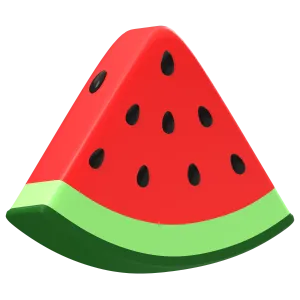
Product
Ghost CMS Product cards allow you to showcase products or recommendations with style. Include an image, description, price, and a call-to-action button that links to an external product page. Use Product cards to feature affiliate links, promote your own products, or highlight items related to your content.

Vintage Television Set
Step back in time with this charming Vintage Television Set. Its classic design and warm wood finish evoke a sense of nostalgia, making it a unique and eye-catching addition to your home decor.
Transform your space with this non-functional Vintage Television Set. Ideal as a decorative accent piece for your living room, bookshelf, or entryway, it brings a touch of retro charm to any setting.
Add a touch of whimsy to your decor with this Vintage Television Set. Perfect for displaying plants, small sculptures, or your favorite vintage finds, it's a conversation starter that's sure to delight.
Images
Ghost CMS Image cards provide the foundation for adding images throughout your posts and pages. Use them to enhance storytelling, illustrate points, or break up blocks of text. Image cards support image uploads (including optimization for different screen sizes) and can be styled with captions or used within galleries.


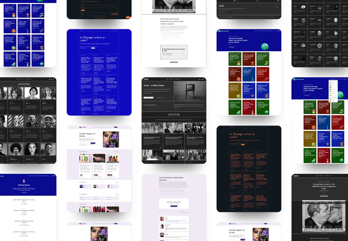
Gallery
Ghost CMS Gallery cards allow you to display a visually appealing grid of images within your posts. Use them to showcase a portfolio, a series of related photos, or a collection of screenshots. Gallery cards support up to 9 images at a time, and automatically optimize them for fast loading and responsiveness across different devices.


SignUp Cards
Ghost CMS Signup cards offer a seamless way to add signup forms directly within your posts and pages. Use them strategically to encourage visitors to join your email list, become paid subscribers, or register for an account. Signup cards are fully customizable, allowing you to control the wording, design, and where they appear within your content.
Code Syntax Highlighting
html {
    font-size: 62.5%;
}

body {
    line-height: 1.6;
    -webkit-font-smoothing: antialiased;
    -moz-osx-font-smoothing: grayscale;
}

img, picture, video, canvas, svg {
    display: block;
    height: auto;
    max-width: 100%;
}

iframe {
    display: block;
}

input, button, textarea, select {
    font: inherit;
}

p, h1, h2, h3, h4, h5, h6 {
    overflow-wrap: break-word;
}

h1, h2, h3, h4, h5, h6 {
    line-height: 1.2;
}